Questrade
Centralizing Edge Mobile screens into a scalable page library for faster and more consistent design work.
00

problem
As Edge Mobile grew, design files, screens, and flows became scattered across multiple Figma files and pages. Designers often had to spend significant time searching for the correct screen, validating whether it was the latest version, and reconstructing flows from different sources. This fragmentation slowed down design work, created inconsistencies across screens, and made onboarding or collaboration with other designers and developers more difficult.
solution
I scoped and built a centralized Edge Mobile Page Library that consolidated all 99+ possible Edge Mobile screens into one organized system. The library created a single source of truth where designers could quickly find, reference, and compare existing pages before designing new ones. This reduced time spent searching for assets, improved consistency across flows, and created a scalable foundation for future Edge Mobile work.
During my internship at Questrade, I worked on the Edge Mobile experience and identified a recurring problem: design assets, patterns, and page references were scattered across different files, making it difficult for designers and cross-functional partners to work efficiently and consistently.
To address this, I scoped and built a centralized Edge Mobile Page Library that brought together all possible Edge Mobile screens into one organized system. This work focused on improving findability, reducing duplicated effort, and creating a more scalable foundation for future product work.
tl;dr
I consolidated scattered Edge Mobile pages and components into a single centralized design library covering all 99+ possible Edge Mobile screens, making the design process faster, clearer, and easier to scale across teams.
About Edge Mobile
To learn about Edge Mobile and its features, explore the app through this link below:Learn about Edge Mobile
Problem Statement & Goals
How might we create a centralized and scalable page library for Edge Mobile so designers can quickly find, reference, and build on existing work without friction?
To create a single source of truth for all Edge Mobile screens
To help quickly onboard new members (designers, devs, product) working on Edge Mobile
To empower designers to discover and understand Edge Mobile’s designs, patterns, and principles
To create an easily maintainable system
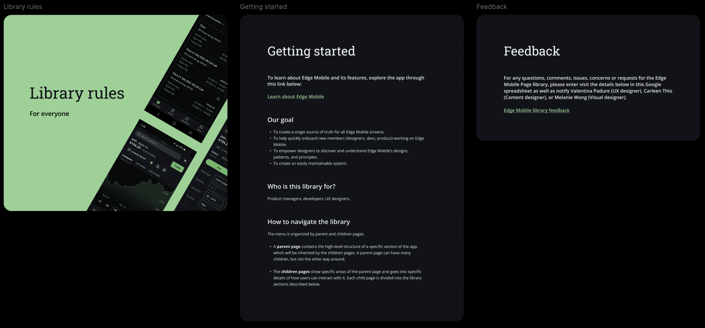
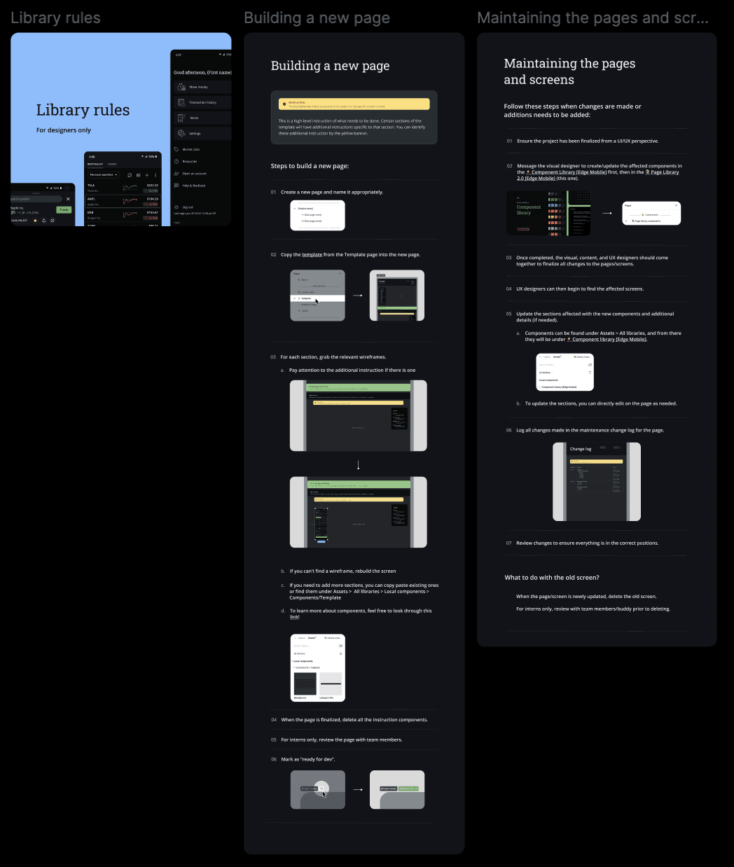
Library Rules
I created 2 different sets of rules — one for anyone accessing the library (i.e developers, product managers, and UX designers), and one specifically for UX designers. The general library rules discuss how the library functions, and the rules for designers walk through the steps for building a new page & maintaining/updating the existing pages.
Auditing the current state
I began by reviewing the existing design ecosystem to understand how screens were currently stored, organized, and reused. This helped reveal where duplication, inconsistency, and navigation issues were happening most often.
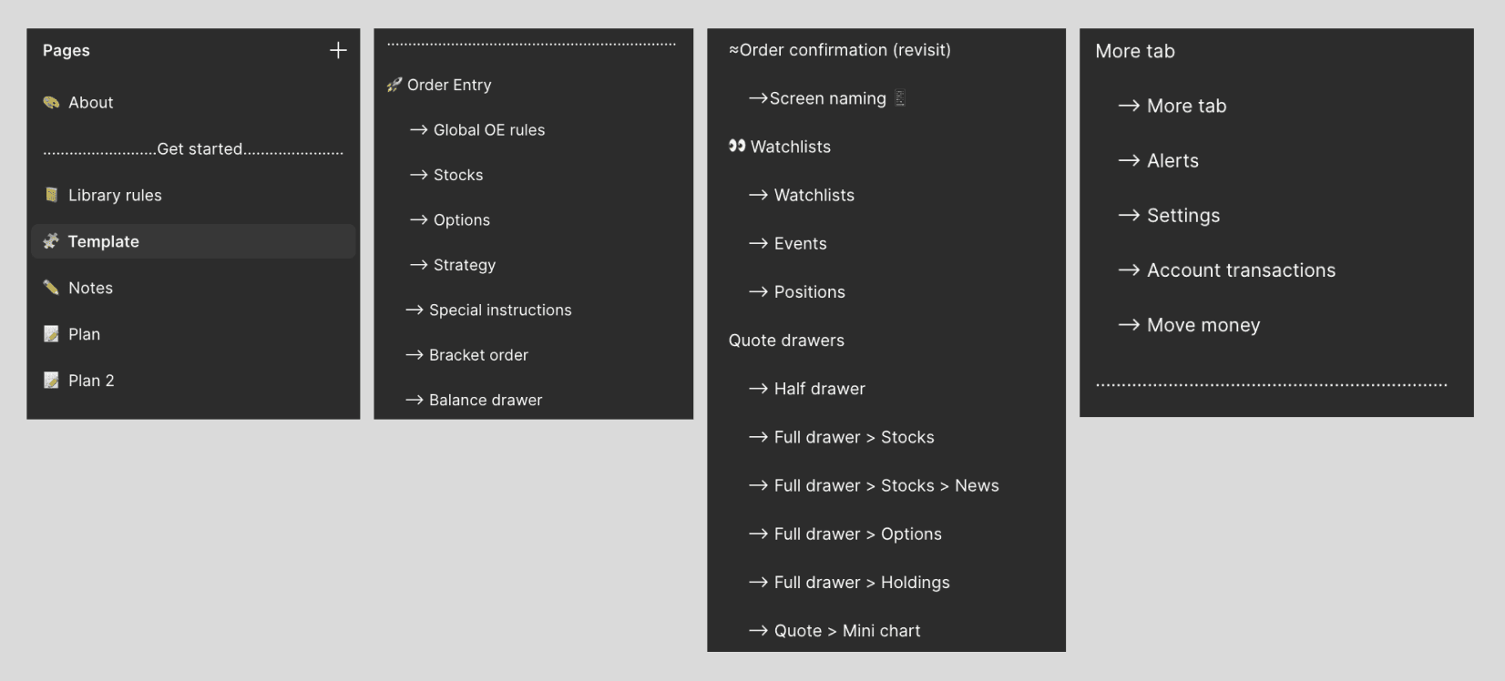
From there, I mapped out the different page types, screen states, and user paths that existed across Edge Mobile. This gave me a clearer sense of the full system and what the library needed to capture. I sorted the pages into clear categories, and created a page solely for walking through the template.
Building for scale
Since Edge Mobile would continue evolving, the library needed to be more than a static archive. I approached it as a living system that could support future updates and new screens over time.
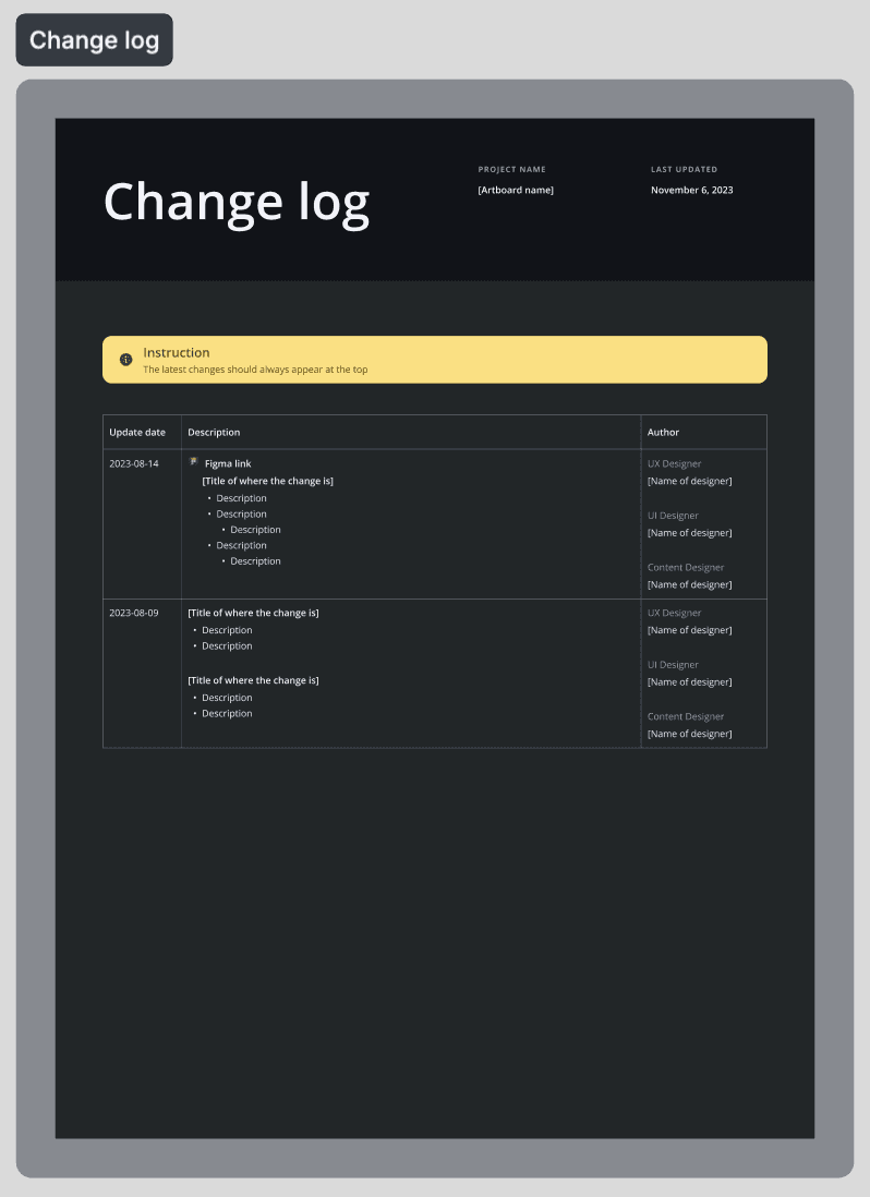
To make it sustainable, I prioritized clarity, structure, and consistency so the library could remain useful as more contributors worked within it. A change log is created for each page, so designers can clearly track their changes as time goes on and updates are pushed out.
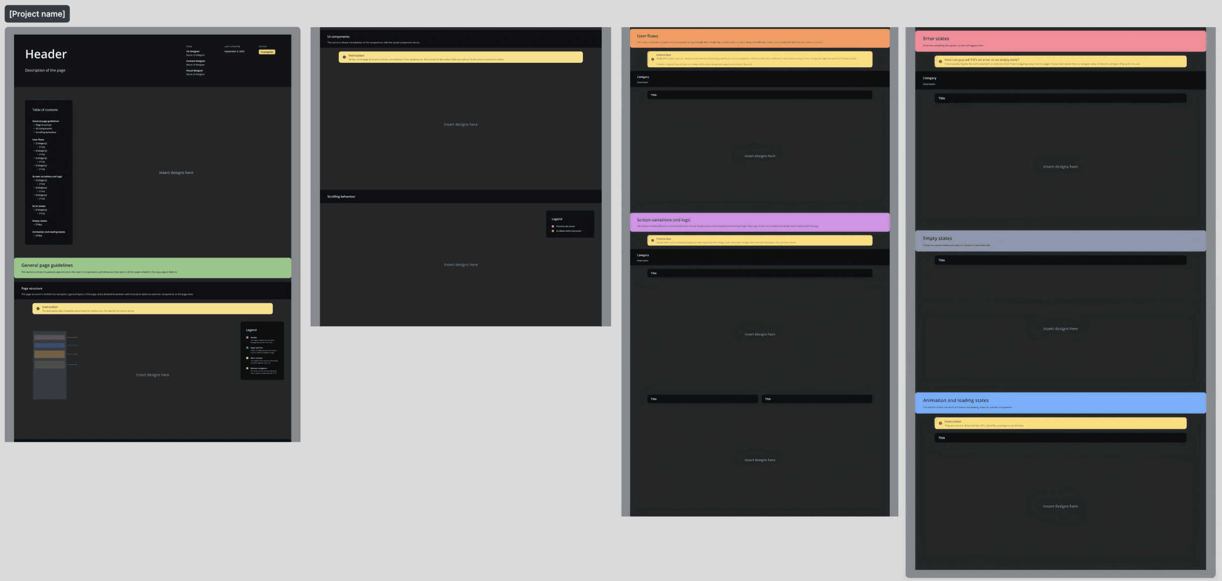
Template
Each template is clearly split up into different sections:
Table of contents
Contains the default screen, which is the entry point of the user flows.General page guidelines
This section outlines the general page structure, main UI components, and behaviour that exist in all the pages related to this feature.Page structure
The page structure consists of two parts:A general layout of the page
A detailed breakdown with descriptive labels for each component
UI components
This sections show the page breakdown with the actual component names.User flows
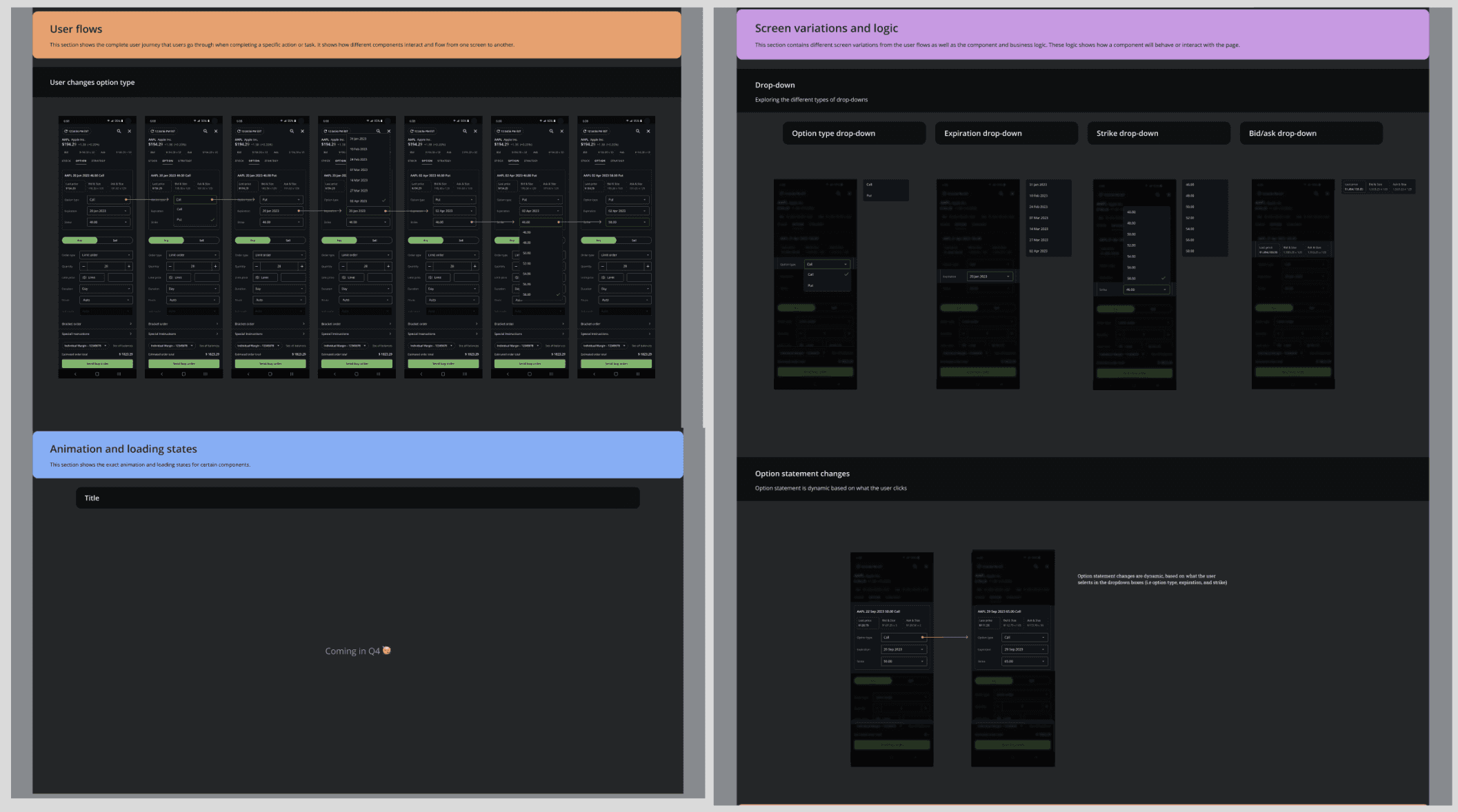
This section shows the starting point and the complete user journey that users go through when taking a specific action or task. It shows how different components interact and flow from one screen to another.Screen variations and logic
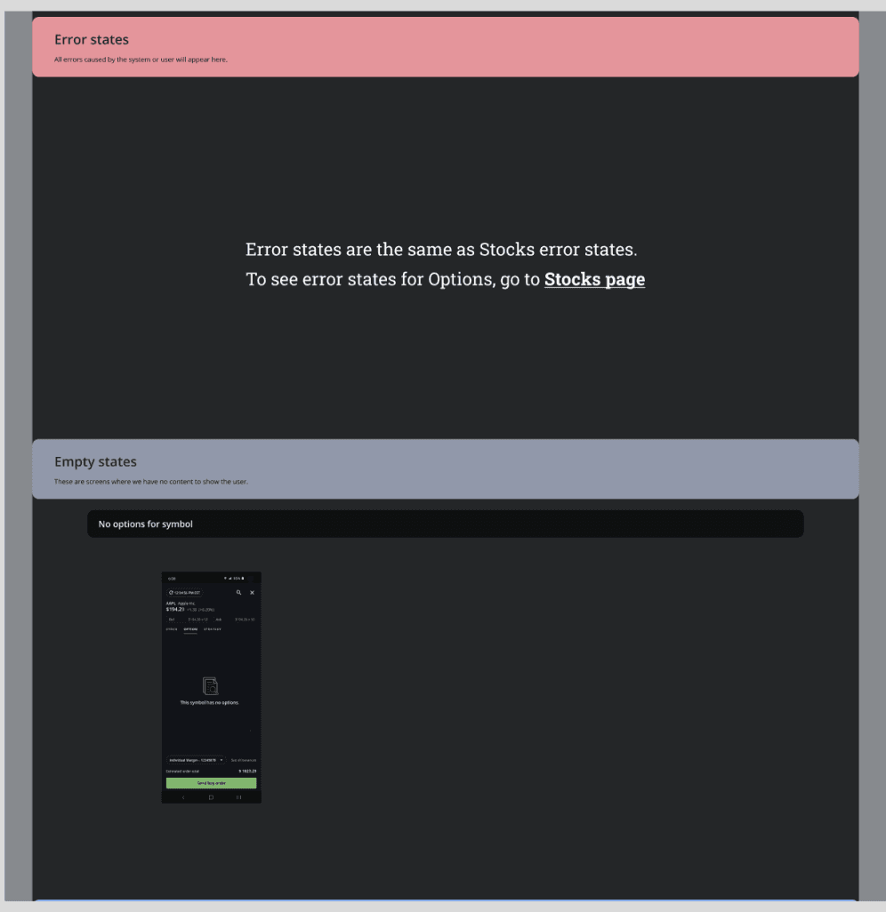
This section contains screen variations of certain pages from the user flows as well as component and business logic.Error states
All the errors caused by the system or user will appear here.Empty states
These are screens where we have no content to show the user.Animation and loading states
Shows exact animation and loading states for certain components.
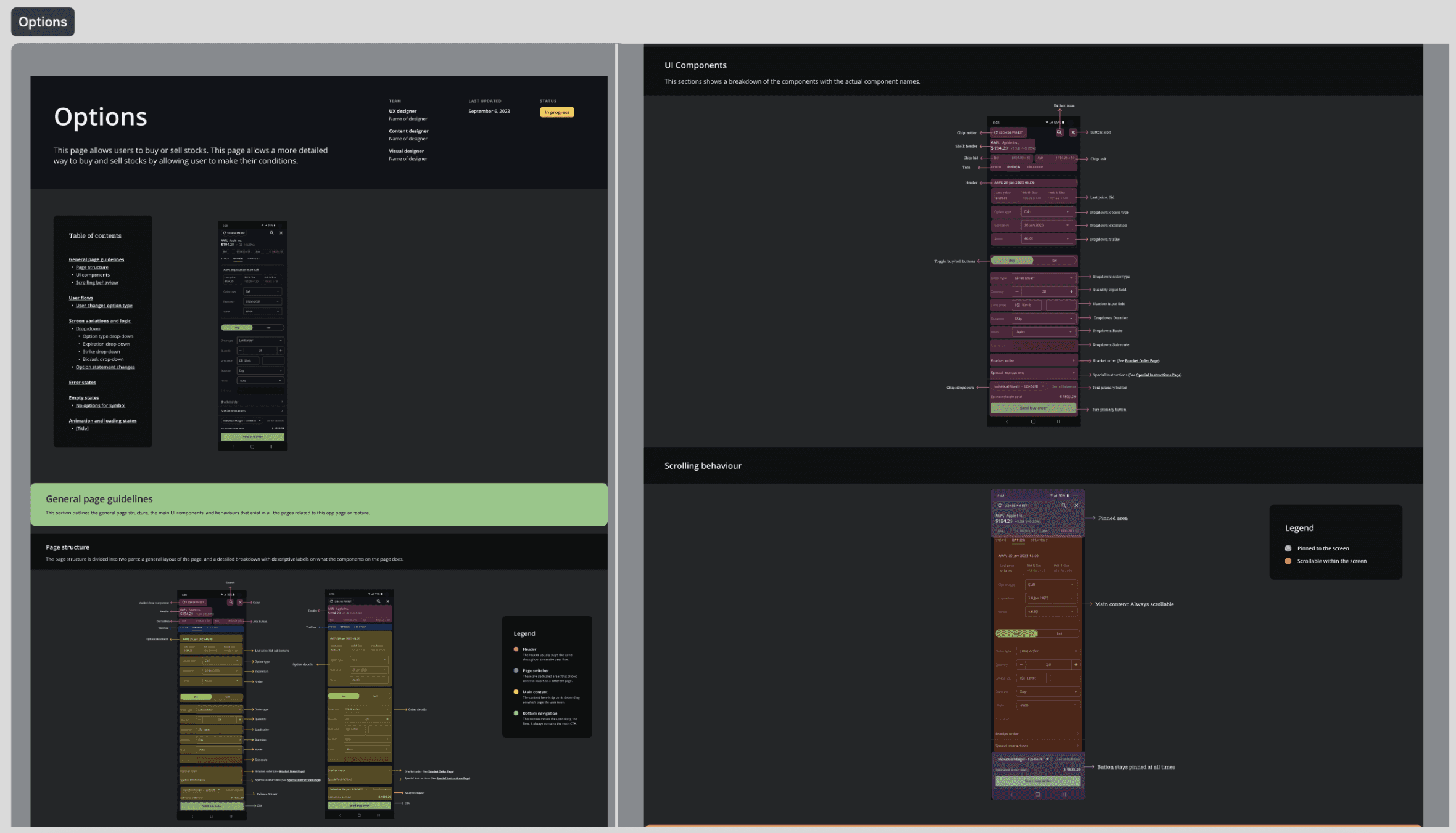
Options Page
Here's what one page would look like in the library (for the Options Page!):
What I learned:
This project reinforced how much internal systems shape the quality and speed of product design work. Even when users never directly see a design library, the structure behind the scenes has a major impact on team efficiency, consistency, and the ability to scale.
I also learned the value of thinking at the system level. Rather than solving for one screen at a time, this project required understanding the full product landscape and designing a resource that supported broader workflows across the team.
A key takeaway is that good design work is not only about crafting user-facing interfaces. It also includes building the internal foundations that help teams work better, move faster, and create more consistent experiences over time.
duration
september 2023 - december 2023
role
product designer
team
1 product designer, 1 product manager
category
UI/UX

